Advanced charts
Advanced charts are a powerful way to display complex data sets. While less intuitive than basic charts, the visualizations should still tell a story the user can understand.
Note: Advanced charts are not included in the Carbon Charts repository yet. To see our roadmap, make feature requests, or contribute, please go to the carbon-charts GitHub repository.
Alluvial diagram
Alluvial diagrams are a type of flow diagram that represents changes in network structure over time.
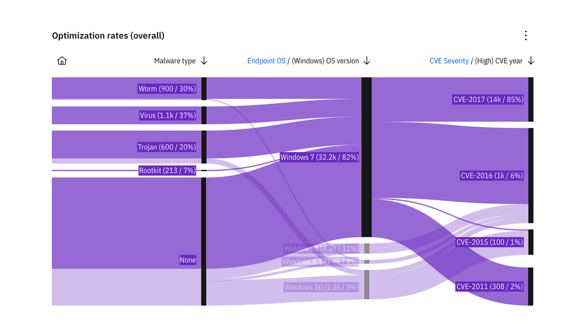
Example of an alluvial diagram
Heatmap
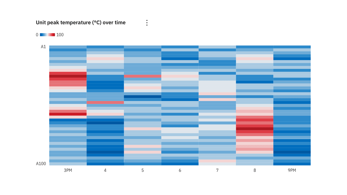
A heat map is a graphical representation of data where individual values contained in a matrix are represented as colors.
Tree diagram
A tree diagram visually represents a hierarchy in a tree-like structure.
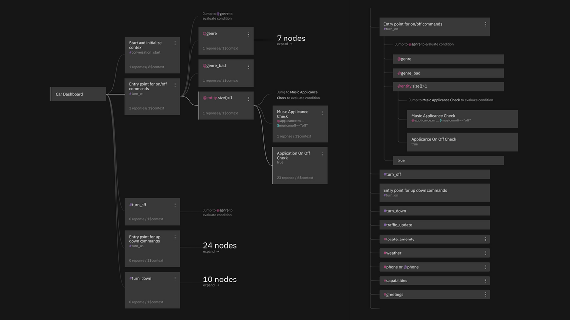
Tree diagram, node view vs. list view
Geography with overlays
Choropleth map
A choropleth map uses differences in shading, coloring, or the placement of symbols within predefined areas to indicate the average values of a property or quantity in those areas.
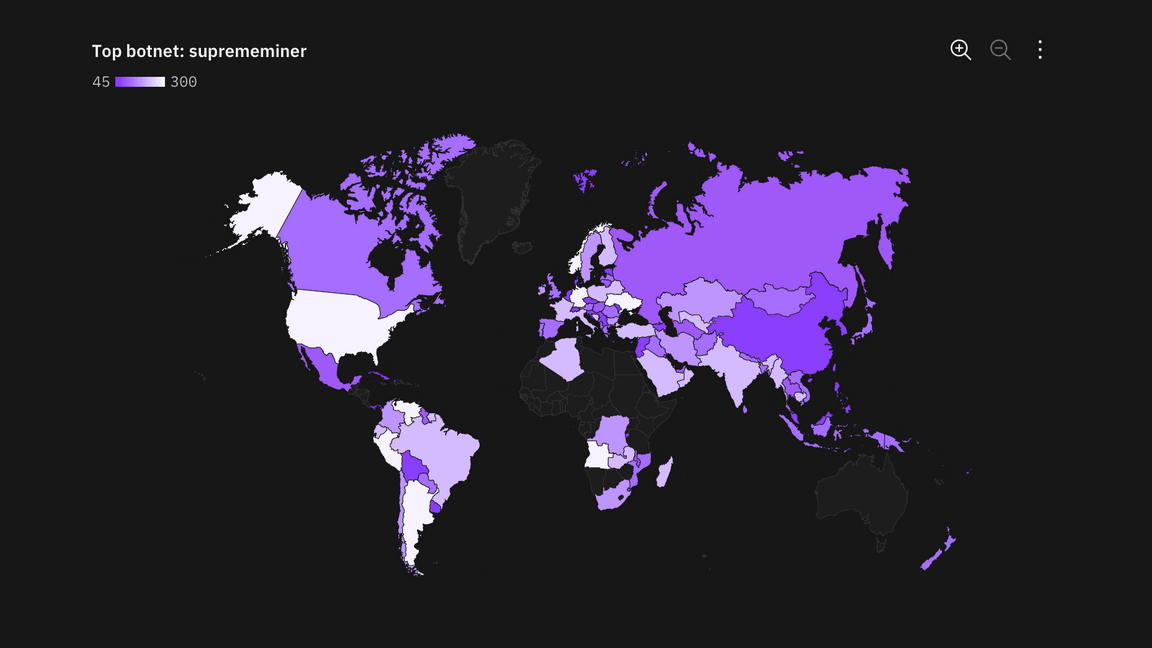
Example of a choropleth map
Proportional symbol
Symbols driven by data are overlayed in geographical regions. A common symbol used is a bubble with the area of the circle proportional to its value in the dataset.
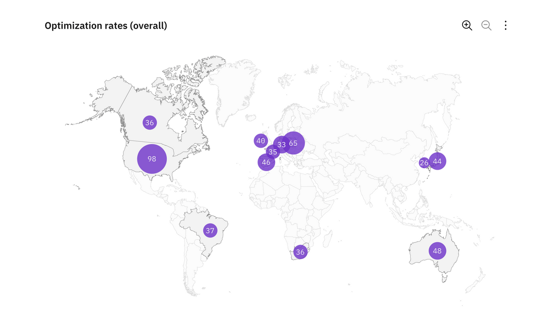
Example of a proportional symbol
Connecting lines
Connection maps display points on a map connected by straight or curved lines.
Connection maps are most useful when showing connections and relationships geographically. They can also be used to display map routes through a single chain of links.
Connection maps are particularly powerful when revealing spatial patterns through the distribution of connections or by how concentrated connections are on a map.
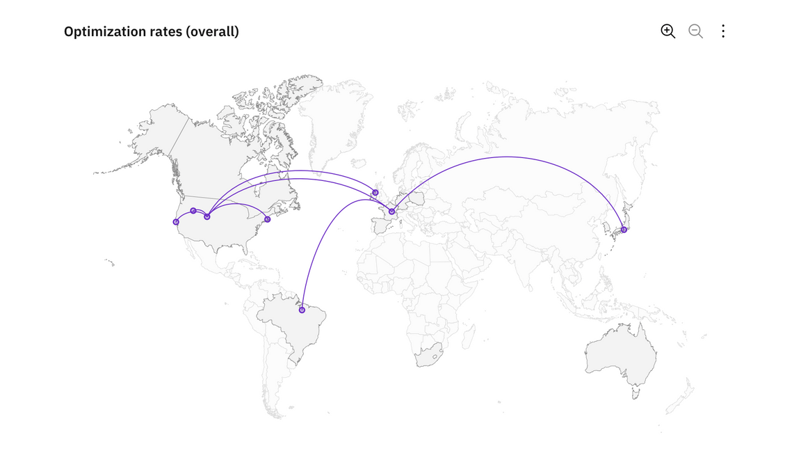
Example of a map with connecting lines